
The choice of shades that are going to be predominant in our home is something very important, since it is a palette that we will see every day and that should ambient the spaces. Nowadays they take a lot of neutral tones from the Nordic style, but there are many more ideas that can be inspired by.
It is important to think about which colors to choose for our stays before we start buying things. If we are quite clear what kind of colors we are going to put then we will know exactly what to buy and will not spend in vain.
Contents
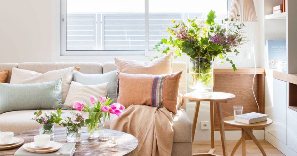
Use neutral tones
One of the simplest ways to decorate a space and combine everything is to use the great neutral tones. This kind of shades are white, beige, gray or black that go with everything. It is best to use light nude tones to give brightness to the spaces, since we don’t want the rooms to look smaller. That is why black and dark gray should be used very sparingly. What the Scandinavian style has taught us is that with these shades we can achieve very elegant environments that also have a serene touch. The light multiplies with whites, so that we enjoy bright environments. In addition, this type of shades can be easily added to color accents to vary the decor. Do not hesitate to paint the walls white to enjoy an easy space to decorate.
Pastel shades
Pastel colors can be a great choice for home. They are soft colors, which give light and at the same time provide us with that touch of color that you like so much. Pastel colors are soft, although we should not use more than two that match well. These colors have also become very popular thanks to the Scandinavian style. They are shades that go well for any environment and are also trending.
No more than three colors
When adding shades to your home, we recommend to stick to no more than three colors. In these three colors one should be the protagonist, another secondary and another appear only in small strokes. It is a simple rule that helps us avoid adding too colorful and then we lack harmony in the spaces. This idea is perfect for any environment and allows us to decorate more easily.
Get inspired by color palettes
On the web you can find out how to combine various color palettes, with hundreds of ideas. There are shades that always go well together so look for inspiration and discover combinations that may be suitable for you. You don’t have to know about colors because in the inspirations you’ll see which ones match well and which ones don’t. A simple rule is to choose similar shades, that is, if you take soft tones that are all in that line, even if they are different colors.
Watch out for prints
There are prints that can fall in love, but they do not always match well with the idea we have thought out. If we are struggling to combine colors it is better to avoid prints or stick to those that are simpler, that is, those that use one or two tones only, such as those with plaid, stripes or polka dots. If they have too many tones, we’ll be getting too complicated. This type of prints would be an option if we have chosen very simple environments with neutral tones and want to put a note of colour.
Strong Tones
In the vast majority of cases strong tones are not recommended because they subtract light and get tired more than soft tones, which provide serenity. But if you like such shades use them sparingly. You should use them for example in textiles, on some cushions or in small details such as vases.